The Grittiness of Grunge
Most graphic design trends come about unexpectedly, evolve over time, become pointless, then one day, BAM just as quickly as it appeared, it’s vanished from the design space.
With most of the web deviling in flat design, clean simplistic layouts and the apple inspired look and feel; today I am going a wee bit off track and taking a look at one of my favourite trends that still holds its rightful place in the web world today – Grunge design.
So what is Grunge design?
The term “Grunge” was first coined to stand for a specific type of music, influenced by punk, rock and heavy metal.
The design itself takes on the rawness of punk and rock, and incorporates real life imagery inspired by the urban and industrial scene – it’s very stylistic, less uniform, and is easily recognizable.
When you hear the term ‘Grunge Design’ you probably associate it with something that is disorganized, dark, gritty and a bit radical.
Too right, it’s radical!
Relishing in dirty backgrounds, layered textures, torn edges, hand drawn doodles, distressed fonts, real life imagery and cut outs, grunge design pretty much breaks every rule of ‘good web design’.
Forget white space and pixel perfect elements. Ripped edges, uneven lines and crooked elements are much cooler. Grid, what grid?
The great thing about this type of style is there are no rules!
Don’t be fooled into thinking ‘Grunge design’ means it always has to be gritty, dark and in your face, in the hands of the right designer and used in a very subtle way, this trend can be extremely versatile boasting the use of bright colours balanced by gritty design elements.
Rules are there to be broken, and it’s a designer right to be as creative and original as they see fit.
Right place, right time.
Like any design style, there is a time and place for its use to maximise effectiveness and capture user interest. One of the pitfalls with Grunge design is it can quickly become an eye sore if you have forgotten about relevance and your target audience.
While Grunge design is perfect for blogs, band pages, clothing stores, music huts or any site that incorporates the urban scene, street art, skating (just to name a few), there will always be the wrong time for it too.
The originality of grunge isn’t everyone’s cup of tea, some will loath it, while others will appreciate its desire to dare common perceptions about what good design is. In the web design scene, we only see this style applied sparingly, which is probably best, so it retains its impact for the right brands. If you’ve taken the time to brainstorm a unique and creative business name, you’ve established a brand that stands out and makes a statement and for the anti-conventional and the wicked, grunge design can be a true winner! Of course, it’s essential to incorporate this branding into your brand style guide.
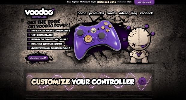
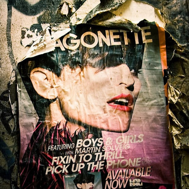
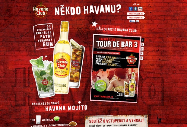
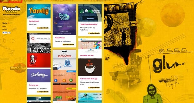
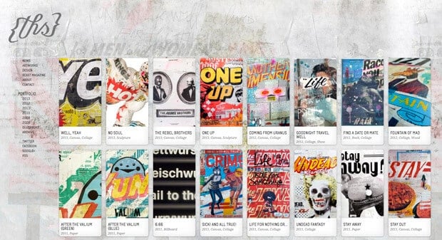
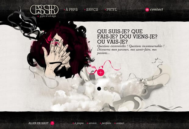
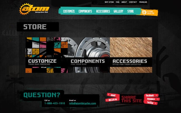
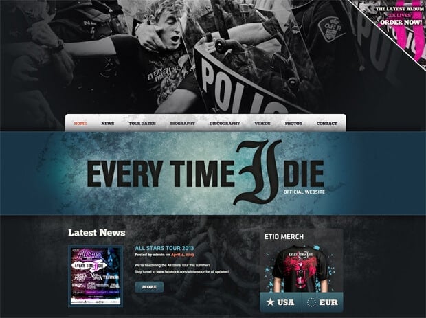
Okay so enough about how awesome Grunge Design is – I’ve scouted the web to show you some sweet examples.
Happy browsing! And if you want to learn about more about design, we wrote a blog on the best fonts to use for your website. We also wrote a comprehensive article on how to create a killer homepage design for your business.
