13 Best Fonts For Websites To Delight Your Customers
Of the various elements that make up a website, fonts are one of the most important for your branding. They can have vivid personalities of their own, coming across as fun, serious, authoritative, or flamboyant; charming, clever, sexy, suave, gentle, dignified, and everything in between. So it’s crucial that they match your brand’s personality as closely as possible, to sharpen the image you’re trying to convey to your customers.
We’ve selected some of the best fonts for websites you can find, based on their readability, variety, and how easy they are to install on your website. They’re all free, too! Let’s jump in.
What makes a good font for website content?
A good website font must meet a number of requirements:
Readable
Fonts are designed to read by people. If we come across a font where the letters are squashed together, where their arms, shoulders, and apexes (these are real terms) are inconsistent, or where their colour changes as though an odd gradient has been applied, we are instantly turned off, and may find ourselves leaving a website for something more practical.
When you delve into the technical aspects of readable typography, things get real complex. But you don’t need to be an expert to identify whether a font is readable: just try reading an example paragraph, and trust your instincts.
Matches your branding
As with fonts, every brand has a personality and character of its own, whether planned or not. The branding for an accountancy firm will probably be wildly different to that of a cutting-edge software company. The personality of a food company won’t be like the personality of a pharmaceutical firm. They all have unique products or services, target audiences, and values, which often dictate the image they want to create for their brand.
Selecting a font that “feels” close to your company’s branding is extremely important. Ideally, you should have a brand style guide that will help you with these decisions, or perhaps you’re in the process of creating one. Either way, good font selection is crucial.
Complementary
Typically, you’d choose two fonts for a website: one for your headers, and one for your body copy. Any more than this, and the design can start to appear messy, even erratic.
When selecting your fonts, the two that you choose should work together nicely. This can be tricky to pin down, and is more of an art than a science. It’s fine for you to select two completely different looking fonts, as long as they “feel” right together, and reflect your company’s branding.
The 13 best fonts for websites
These are our choices for best website fonts, broken down by headers and body copy. Every one of our recommendations is from Google Fonts. They’re free to use, easy to install, and they have a fantastic selection of different font types. They also maintain a high level of quality—Google won’t accept any font into its library. While there’s plenty of font choices on Adobe, Fonts.com, and other services, you’ll have to pay for these, and fonts can be incredibly expensive.
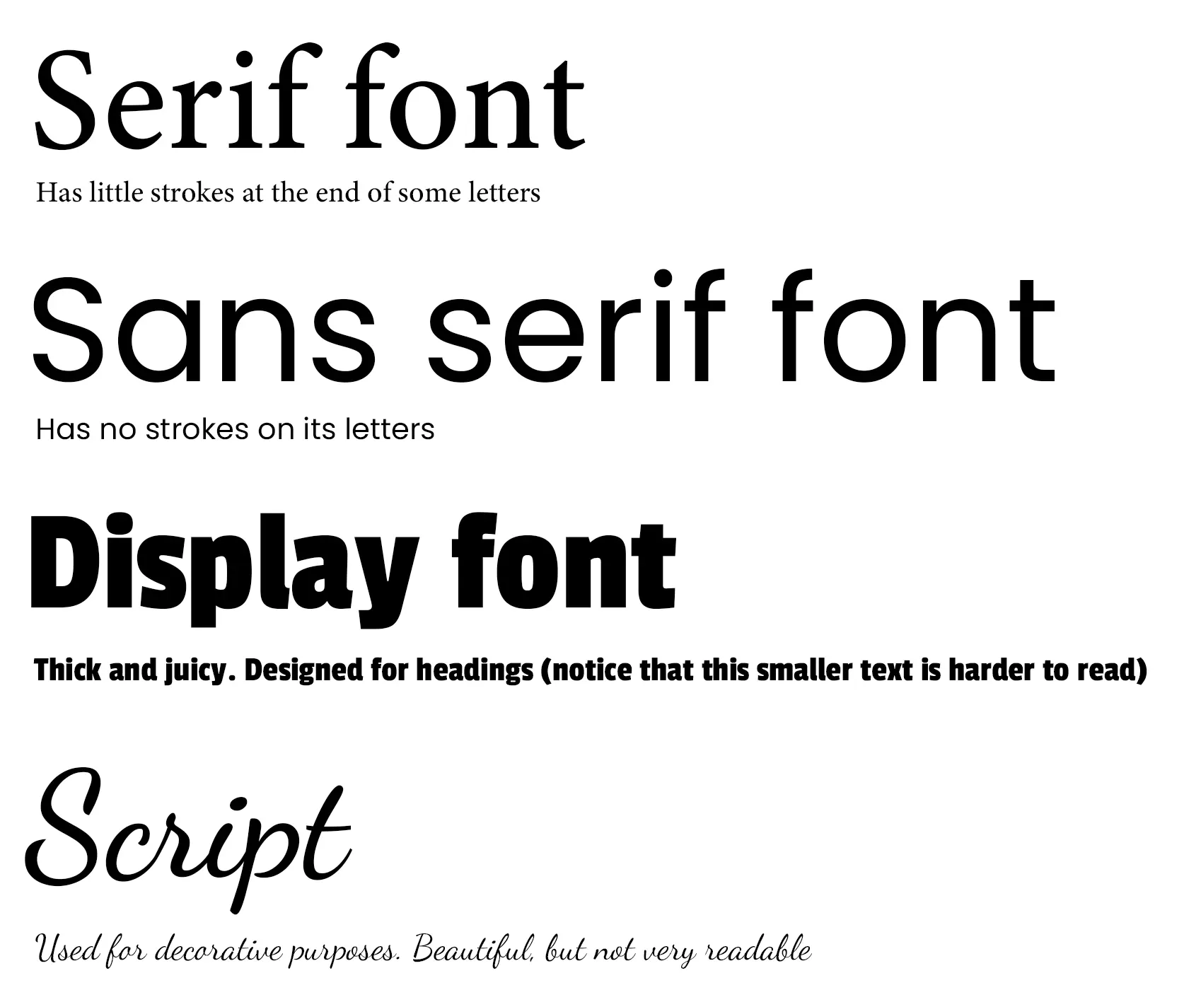
Before we jump in, it’s worth quickly covering the common types of fonts, so you know the terminology:
- Serif—serif fonts are fonts with little strokes at the end of each letter. They are the classic font style, and can seem traditional, established, and elegant.
- Sans serif—sans serif fonts are fonts without strokes at the end of each letter. They are modern, and can seem casual, trendy, and innovative.
- Display—display fonts are designed for large headings. Because readability is less important, they tend to be more eccentric and experimental.
- Script—script fonts are designed to resemble handwriting. They are designed for decorative purposes, and are much harder to read. You won’t want to use these fonts for important pieces of text.
We’d like to give a shout out to One Page Love for providing us with (most of) the website examples for each font type, shown below.
Header fonts
Header fonts are usually big, bold, and attention-grabbing. When it comes to browsing websites, humans are unapologetic scanners who use headings to understand what a page is about before deciding whether to read the body copy. So they’re very important.
Poppins
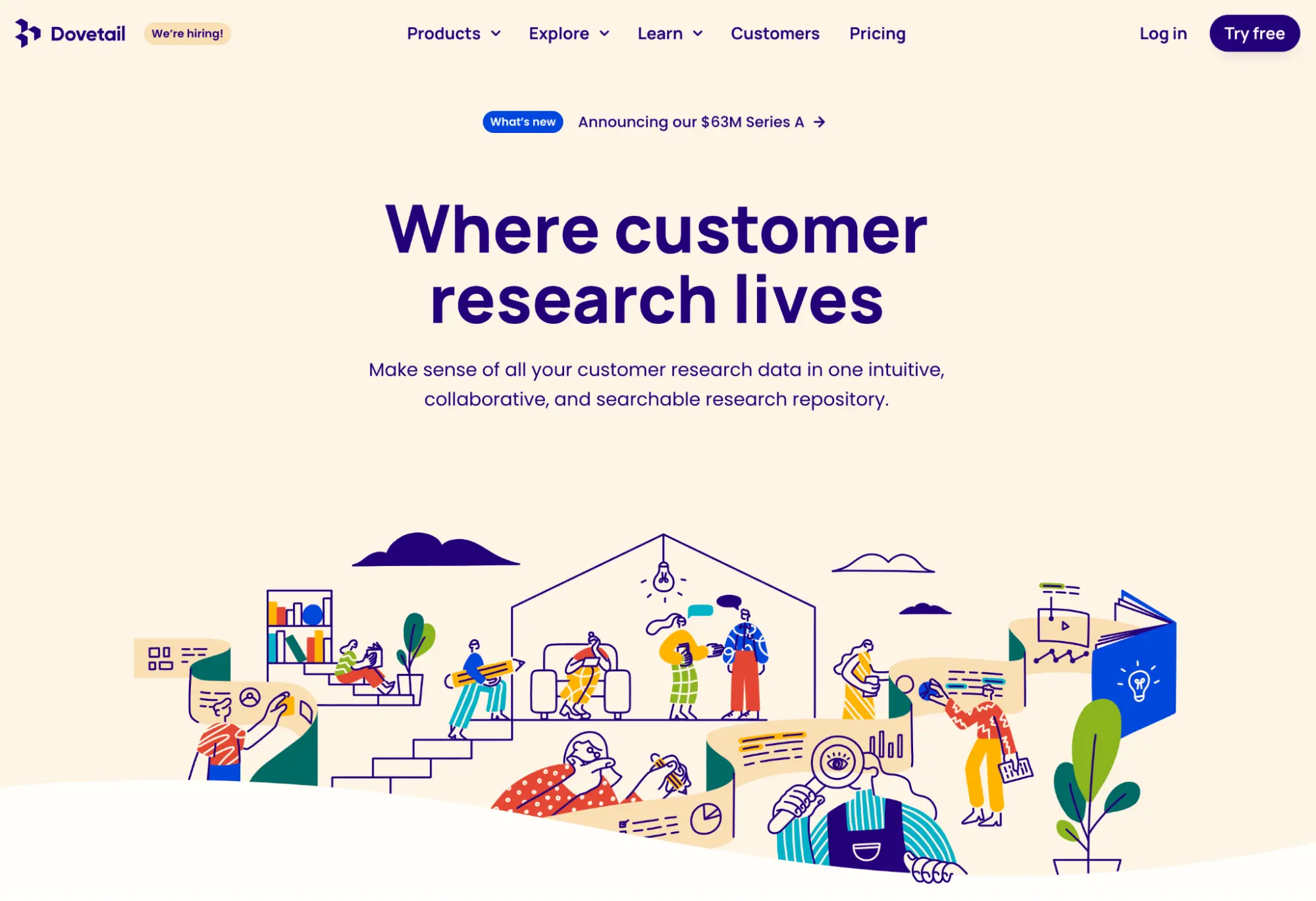
Poppins is a geometric sans serif font. It’s fun and playful, so would suit a brand with these personality traits. The font itself is very simple, with few nicks or flourishes that make it extremely easy to read. There’s also nine unique weights, so a lighter weight could be used for body copy if you wanted.
Roboto Slab
Merriweather
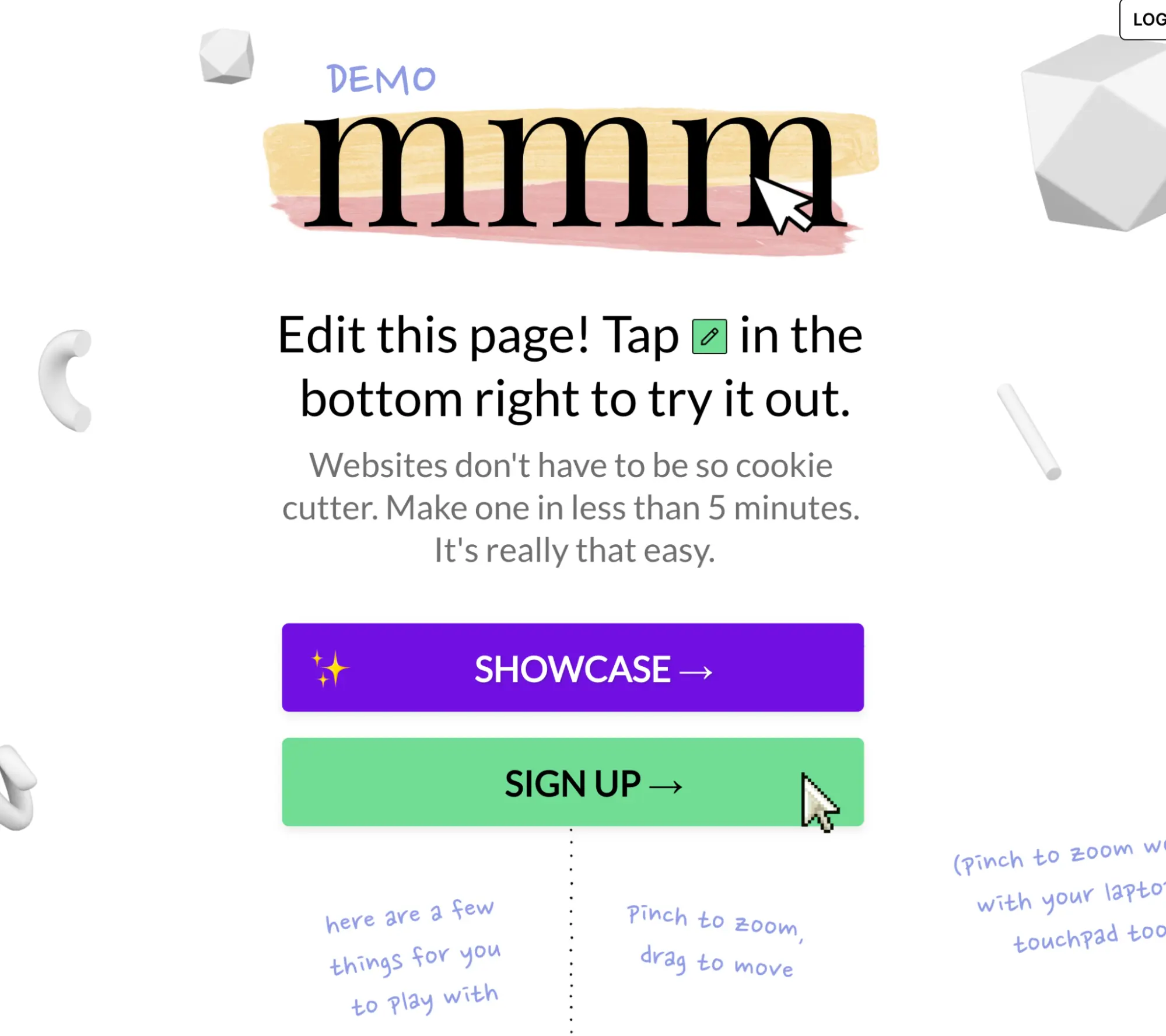
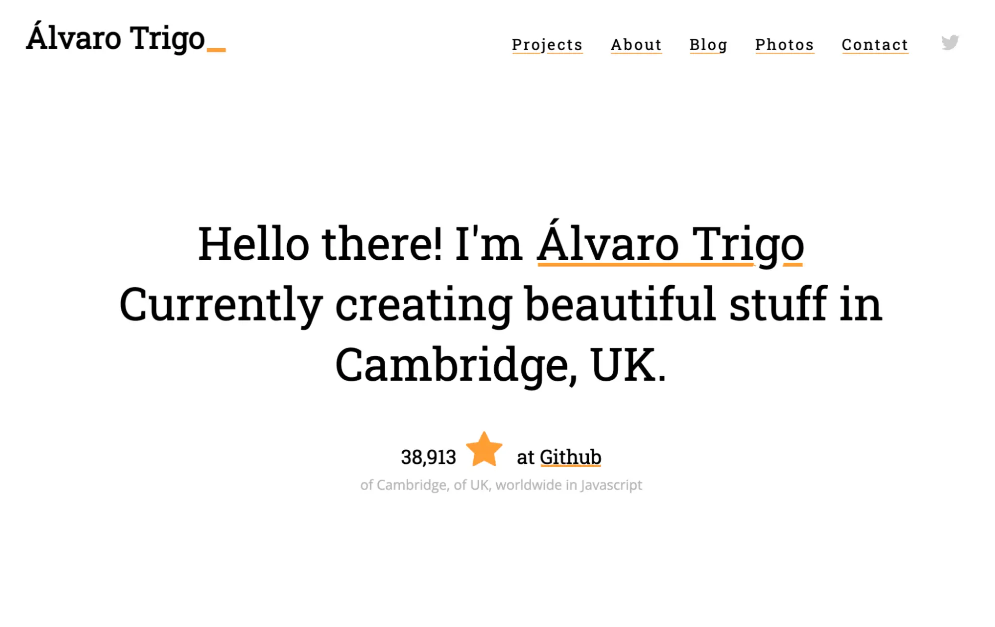
Above all else, Merriweather was designed to be pleasant to read, and it does a fantastic job. It’s a serif font that seems confident and commanding, while somehow being friendly at the same time. This font could work for both serious and playful brands alike, with a versatility that has made it one of Google most popular fonts. And if you’re not sure about the serifs, they have a sans serif version you can use.
Bebas Neue
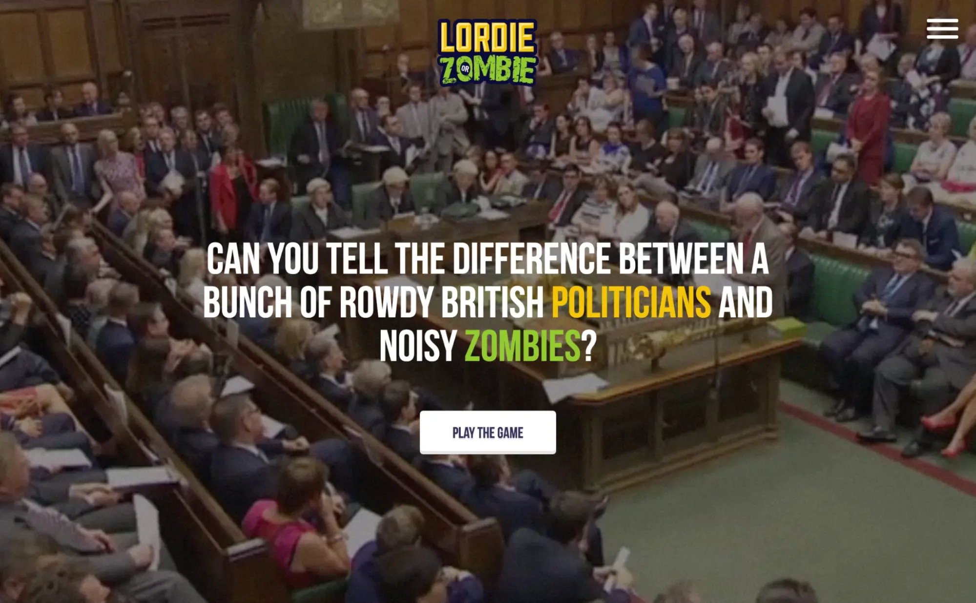
Bebas Neue is a chunky display font that makes a strong impression. It’s characters are tall and narrow, but with plenty of girth. Display fonts are designed to be prominent, and this is no exception. If it were a person, the font might be impish, reliable, and incapable of being fooled, kind of like Winston Churchill in his heyday.
The font is only available in uppercase, which is common for display fonts.
Manrope
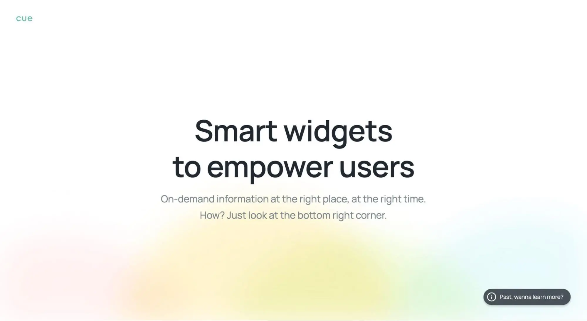
Manrope is smart, stylish, and friendly. It’s the kind of font that would invite you to its impeccable house and serve you craft beer. It may even have a topknot.
This sans serif font would be a winner for a modern tech company, or any other cutting-edge firm that wants to portray its ingenuity. It’s simple, incredibly easy to read, and exudes confidence.
Fredoka One
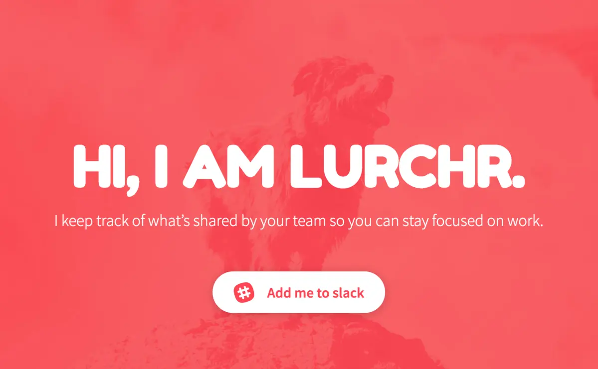
If a bunch of fonts were having a party, Fredoka would be the one dancing on a table with a rubber horse mask on. It’s the epitome of a “fun” display font—big and bold, rounded edges, and impossible to miss. A company that uses this probably wants to convey a spirited, youthful image that sticks in people’s minds. It has a cartoonish feel, so could even be used for a business that sells children’s products.
Body fonts
Body fonts are designed to be read in sentences and paragraphs, so their number one goal is to be readable. These are some of the best from Google Fonts.
Roboto
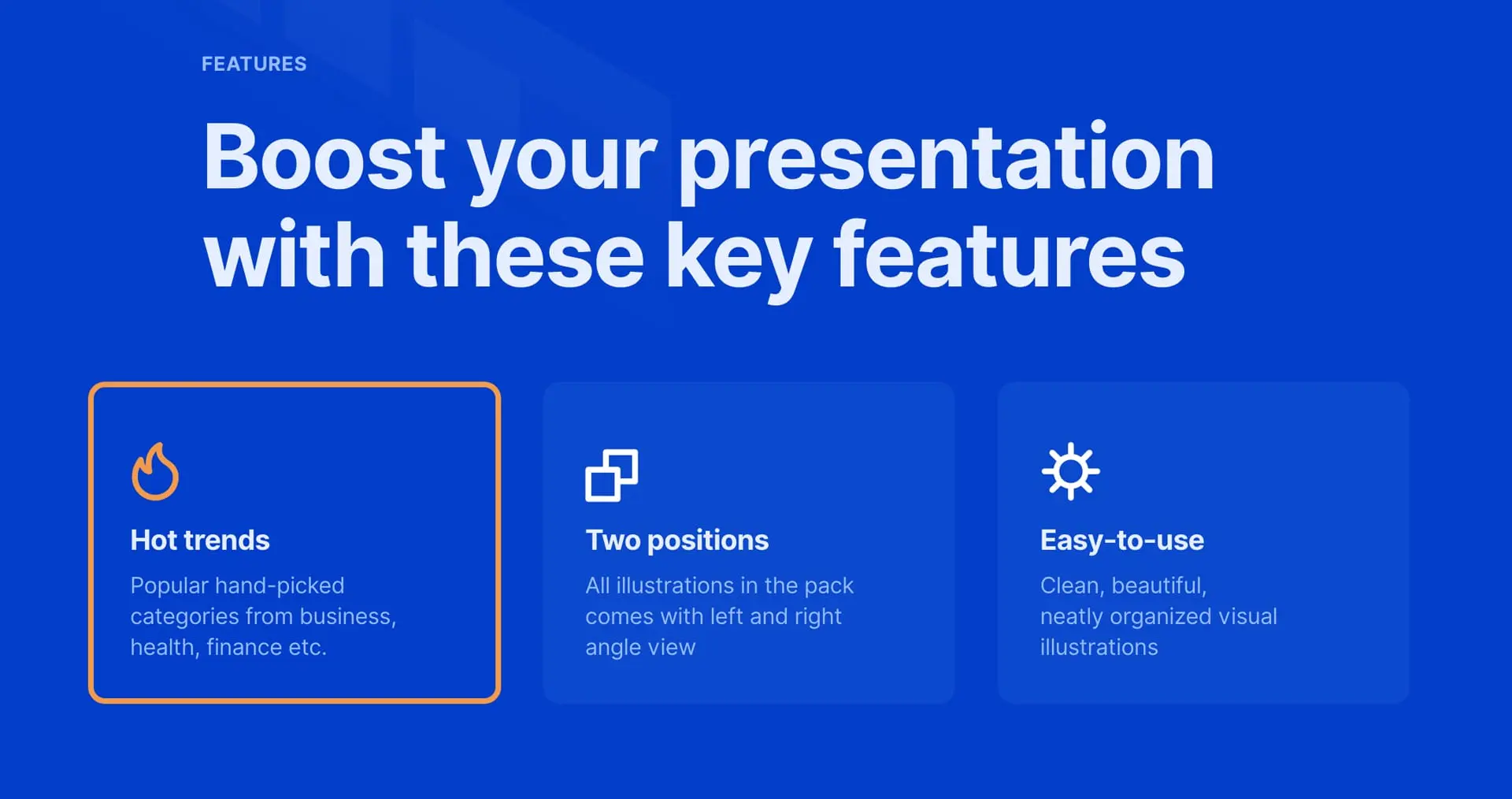
Roboto is a mostly geometric sans serif font that was made for Google’s Android operating systems. If you’ve used an Android phone, you’ll probably recognise it. It’s relatively skinny (to fit onto small phone screens) but highly legible, and undeniably professional. The characters are designed with a natural width, which encourages an easy reading rhythm.
This modern font has already become a classic, and is a great body font choice. In the example above, the font is used in both the header and body copy.
Google also created plenty of variations on this font, including a serif version, a condensed version, and a couple more. You can browse them all here.
Lora

Lora is a gorgeous serif font that oozes professionalism. It has brushed curves, classy serifs, and a solid contrast that makes it suitable for body text. The very first fonts were in the serif style, used in Gutternberg’s revolutionary printing press. This gives the fonts a traditional feel, and are often used by brands that want to express this image.
Rubik
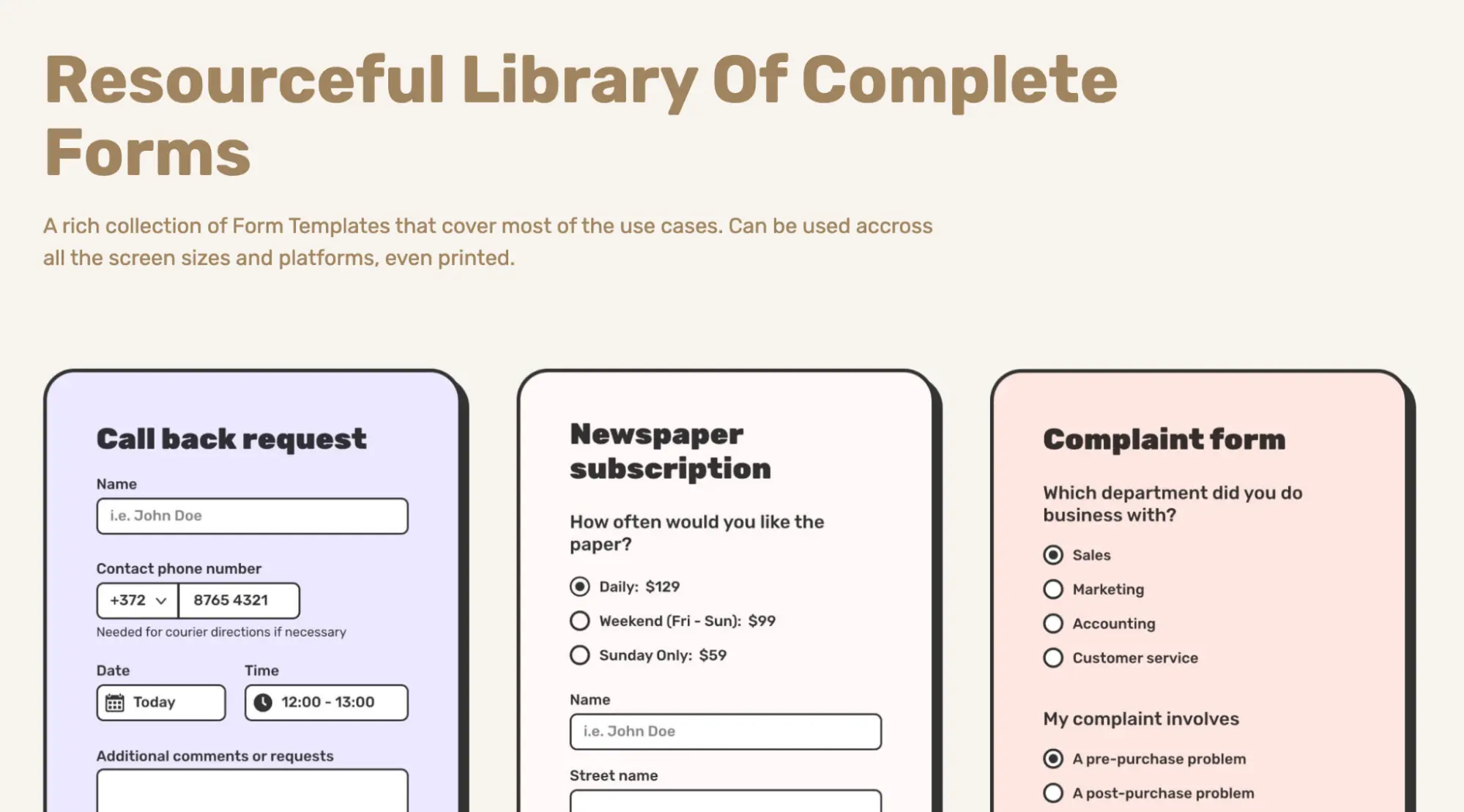
Rubik is another example of a font that can work in both headers and body copy, as illustrated in the image above. It’s a sans serif font that uses lots of rounded edges and a fairly wide character width, which gives it a lovable feel that doesn’t take itself too seriously. You could picture this font in a variety of mediums—websites, digital ads, billboards—where it would quickly seize your attention and get its message across.
Source Sans Pro
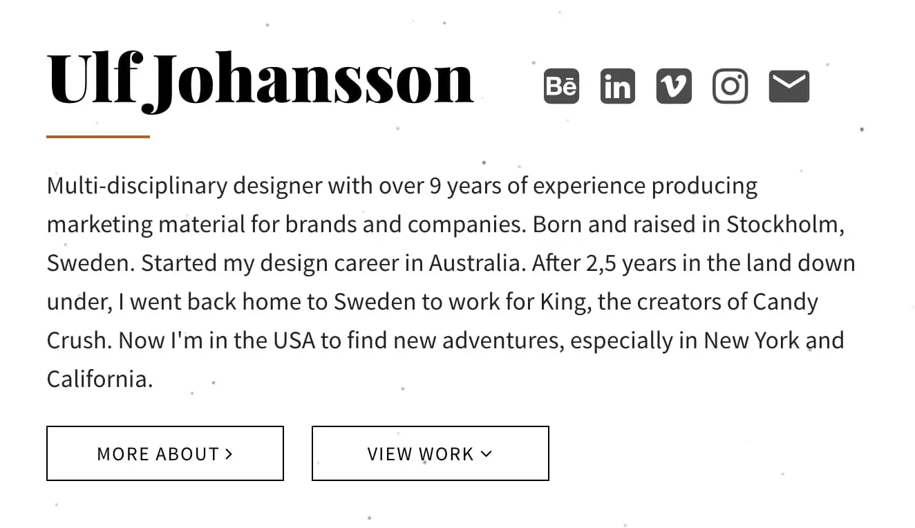
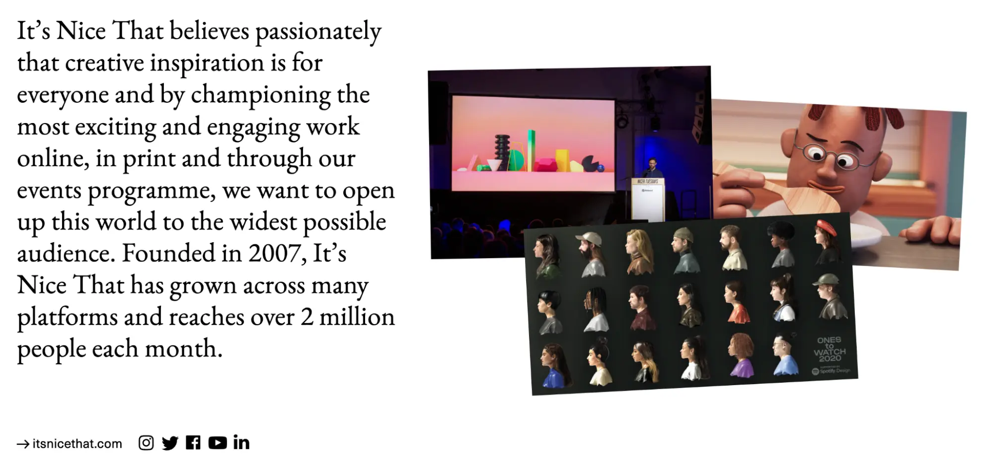
Source Sans Pro is another solid sans serif font that looks great in body and header alike. Its characters are relatively thin which makes it great for squeezing in more text, but despite this, legibility remains high. The font comes across as agreeable, curious, and more than a little honest. It’s a highly versatile font that would work well for a variety of brand images, from the casual to the formal.
Arvo
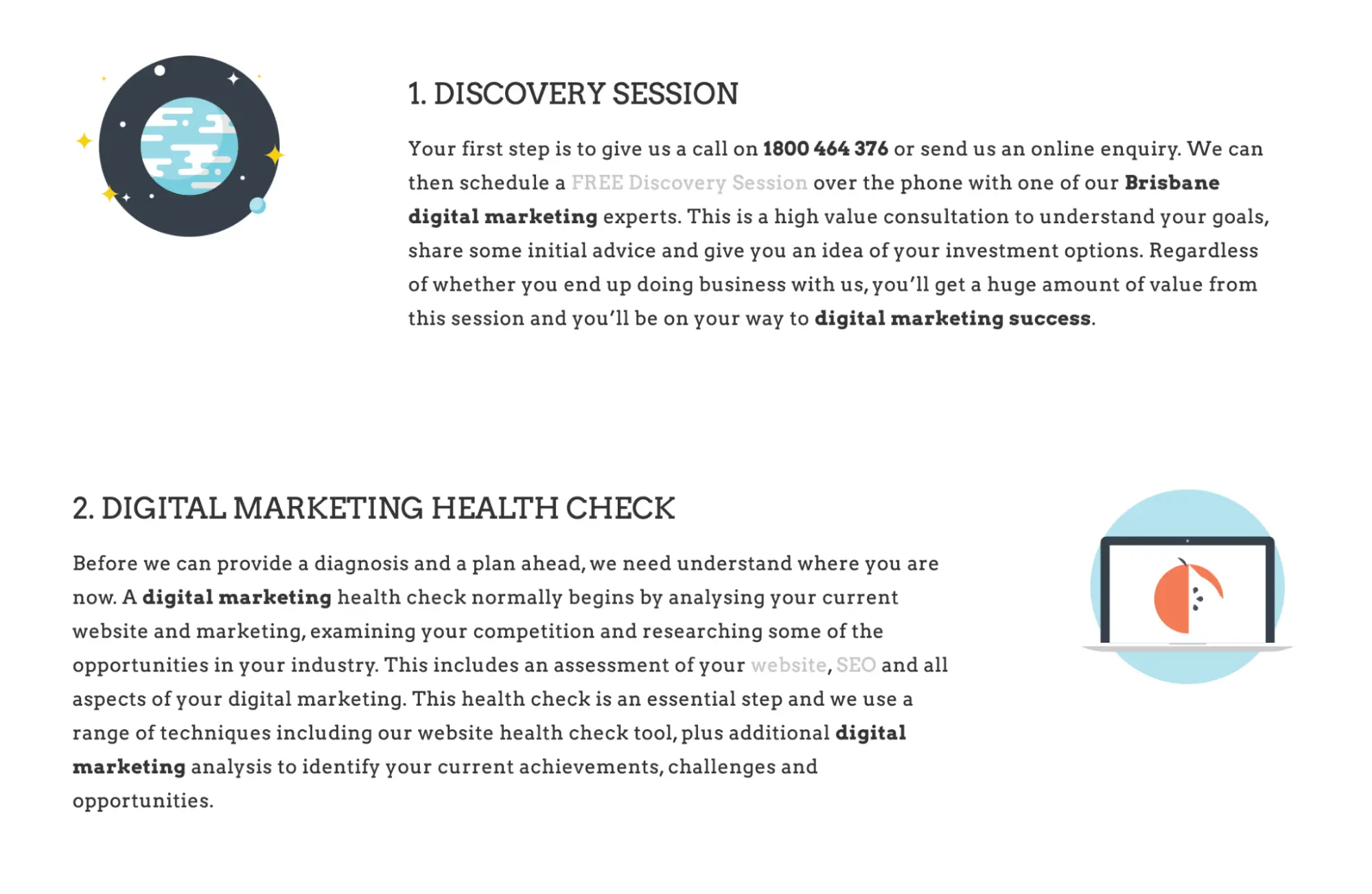
Arvo is a slab-serif font with a modern twist. Slab serifs tend to have blocky, hard-edged characters instead of the usual curves found in serif fonts, which gives them an orderly, almost machine-like feel. This font might work for a firm that wants to display precision and rationality—a declaration that says “we never make mistakes.” The term “Arvo” means “number, value, and worth” in Finnish, which suits it perfectly.
Lato
Lato is similar to Roboto, but because its characters are more rounded, it has a more playful feel. This makes it more suitable to company’s with younger target audiences, who want to portray a cheerful and jovial image, while remaining professional. It’s a highly legible sans serif font that has been adopted by a lot of businesses.
EB Garamond
EB Garamond is another super-stylish serif font with a rich history. It was designed to be a better version of the classic 16th century font Garamond, which was a key moment in the history of typography. The font exudes credibility, and would work well for a company with traditional roots, like banks or financial institutions.


