High-Performing Homepage Designs [+Examples & Layouts]
Every business needs a website, and for new prospects, the homepage is typically the first page they visit. So it needs to be the best-designed page on your entire site—not only beautiful, but offering the exact information that the user needs. That’s why stellar homepage design is so crucial.
Homepages must fulfill a number of critical jobs, such as explaining what your company does, promoting your products and services, and encouraging people to buy from you. But every business is different, so when it comes to homepage design (and website design in general), one size doesn’t fit. The homepage of a clothing company is going to be different to the homepage of an electrician, as both have different goals.
In this article, we’ll explore the most effective things to add to your home page for three common types of commercial site: service-based sites, e-commerce sites, and informational sites. This will allow you to better understand what to include on your homepage, and in what order, so that you can design a page that helps you to achieve your business goals.
Effective homepage design layouts for commercial websites
Here’s a selection of homepage design layouts for various different website types, to give you an idea of what works.
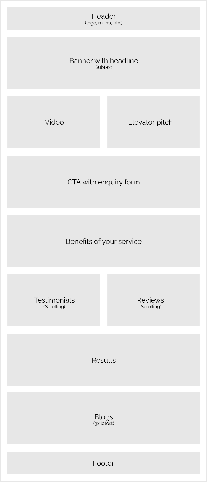
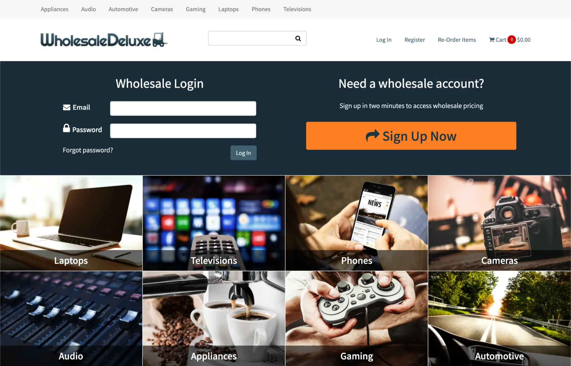
Service-based sites
Service-based sites focus on generating leads and sales. An example might be a small landscaping business, whose director needs to tell prospects about his services, convince them that he’s great at what he does, and then persuade them to get in touch. This is an example of an effective homepage layout for a service-based site:
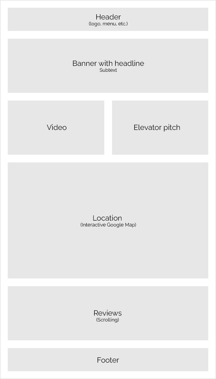
Homepage designs for informational sites
Informational sites provide information about the company. An example of an informational site would be a local coffee shop, which wants to tell you about the quality of their beans, their opening times, and a little of their history. Their goal would be to get you to visit by providing useful, persuasive information to you. Here’s a common homepage layout for an informational site:
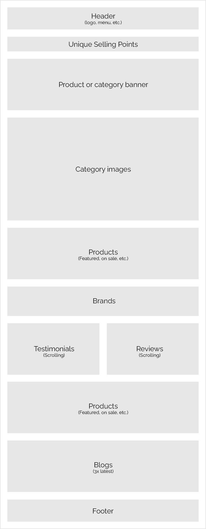
E-commerce sites
E-commerce sites are dedicated to selling the company’s products, which can be purchased directly from the website. This is a good example of a homepage layout for an e-commerce website:
Of course, your website layout will vary depending on your particular business, but these layout examples are a good starting point.
Now that we’ve covered our various types of commercial website, let’s explore the most important homepage elements for each.
What to include on your website homepage design | Homepage design ideas that work
Now that you have a good idea of layouts, what exactly should you include in your website’s homepage design? Which homepage design ideas will encourage people to buy your products or services?
Service-based and informational sites
Service-based sites have one main goal: to produce sales for the business. They do this by showing customers what they offer, convincing them it’s a good service, and nudging them towards the enquiry form (or another desirable action). In contrast, informational sites are designed to provide information to the user, so that they can learn more about the business, their purpose, and perhaps visit them.
Whether you’re creating a service-based or informational website, the following elements will work well for your homepage.
A headline that sells
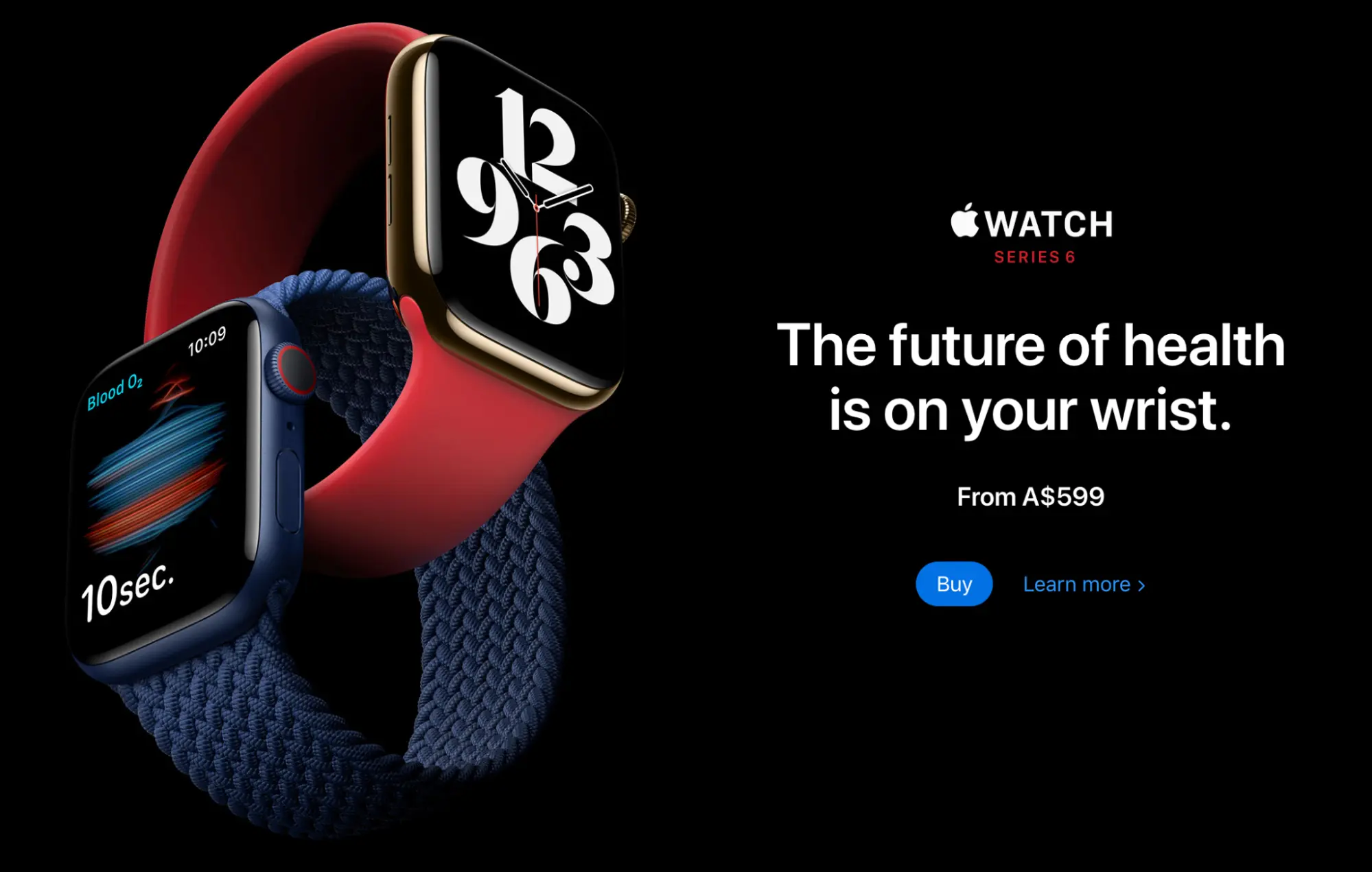 An effective headline that speaks to the user’s needs
On a webpage, the vast majority of people read the headline. It’s the largest element on the page, and people know that it often encapsulates the meaning or purpose of the page. This makes it the most important element, and should contain your most powerful selling point, expressed as succinctly as possible.
Some excellent examples of pithy headlines:
- The future of health is on your wrist—for the Apple Watch. Apple is tapping into the desires of health-conscious customers.
- Grow your business with Google Ads—simple and direct. People use Google Ads to grow their business.
- More stories than ever before—Disney+. This is addressing people’s love of stories and entertainment.
If the headline speaks to the user’s most urgent need, they’re much more likely to read the rest of your content. If the rest of your content is relevant and answers the user’s remaining questions, they’ll be on their way to completing your desired goal (e.g. completing your enquiry form).
Once you have your headline, you can expand on the selling point further in a smaller sub headline, directly below. Or you can use this space to explain some other important selling points.
An elevator pitch is a key homepage design idea
An elevator pitch allows you to quickly explain what your organisation offers, and why people would benefit. This is especially important for businesses who offer services or products that are difficult to understand.
It should be as concise as possible, and able to read in around 20 seconds. It should also appear high up the page (perhaps directly below the headline section), as some people will need to understand what your business offers before the rest of the page can be understood.
Video
If your products or services can’t be accurately and briefly explained in an elevator pitch, an explanatory video is useful. Many people prefer watching videos over reading text, so this may be their preferred way to understand your business. You can also access analytics for the video itself, which reveal how many people have watched, and for how long.
If you can afford it, don’t skimp on the video’s production. A low-quality video with bad animation could do your company more harm than good. It doesn’t need to break the bank, but it does need to look professional, and do a great job of explaining your business.
Call-to-actions (CTA) are necessary for your website homepage design
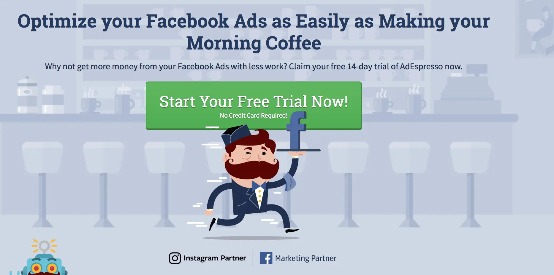
A strong CTA with an enticing headline, and an unmissable button
On websites, a call-to-action is a section that encourages a desired action, such as completing an enquiry form, purchasing a product, or making a booking. It usually follows this format:
- Heading—Get in touch for a free quote
- Text—We offer the best tree care in Brisbane. Chat to our expert arborists today.
- Form—A simple form that includes key fields such as name, email, phone number, and enquiry.
- Submit button—A bright, clearly-visible button that submits the form.
The CTA should also appear fairly high up the page, as this is where people expect to find it. But it’s also a good idea to repeat the CTA further down the page, as the user may have been swayed by your other persuasive elements while scrolling down.
Results
 Proven results help to convince the user that you can help them
If you can show proven results of your work, which outlines your customers’ problems and how you solved them, you’re tapping into the reader’s empathy and persuading them that you can do the same for them. If you have multiple examples of proven results, even better!
These can be extended to full case studies if necessary, which includes long-form feedback from the customer, imagery, and concrete sales figures as a result of your help.
Testimonials
As with the results section, website testimonials are a form of social proof that can convince the user that your services are worthwhile. They tend to be a bit longer than a review, but not so long that they bore the reader—between 30 seconds to a minute to read. They should also include the customer’s name, their picture, and their company name.
Approach your happiest customers and ask if they’d be willing to write a testimonial for your new site design, because it’ll help your business tremendously. Some of them will be glad to.
Recognisable companies you’ve worked with
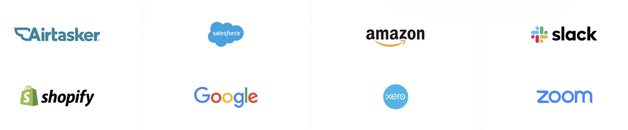 Showing large companies you’ve worked with can help with conversion rates
If you’ve worked with recognisable companies in the past, showing their logos on the home page can do wonders for your conversion rates. This is based on the logic that big companies tend to make good decisions about who they work with, which puts your business in a good light.
If you rub shoulders with giants, tell your customers about it.
Location
The goal of some informational sites is to encourage the user to visit them (i.e. a local business), in which case an embedded Google map showing your location is a great addition.
E-commerce
E-commerce sites are focused on selling products. Their three most important components are great navigation, a solid product page that includes key information about the item, and a smooth checkout process.
For the homepage, these are elements that can help to increase sales.
Top-level category images can make for a cool homepage design
 Top-level categories are a visual way for the user to find products
Product categories can be easier to recognise when accompanied by images. Placing a block of clickable category images on your homepage can be a quick and easy way for customers to find your products, and then delve into sub-categories on the following page.
When adding these to your homepage, always include the category name itself with the image. This can appear either underneath, or laid over the image. If overlaid, make sure that the text is large enough to be read, and in a colour that contrasts highly with the image behind it. Over half a million Australians have some form of visual impairment,1 so it’s important to make your website easy to read, and adhere to web accessibility guidelines as much as possible.
Brands
On an e-commerce site, brands are another way for your users to find your products. As with your top-level categories, displaying a block of clickable brand images allows people to quickly spot and click on their desired brand. If you have a mega menu (a large dropdown menu with categories displayed in columns), you can also include your brand logos there.
Products
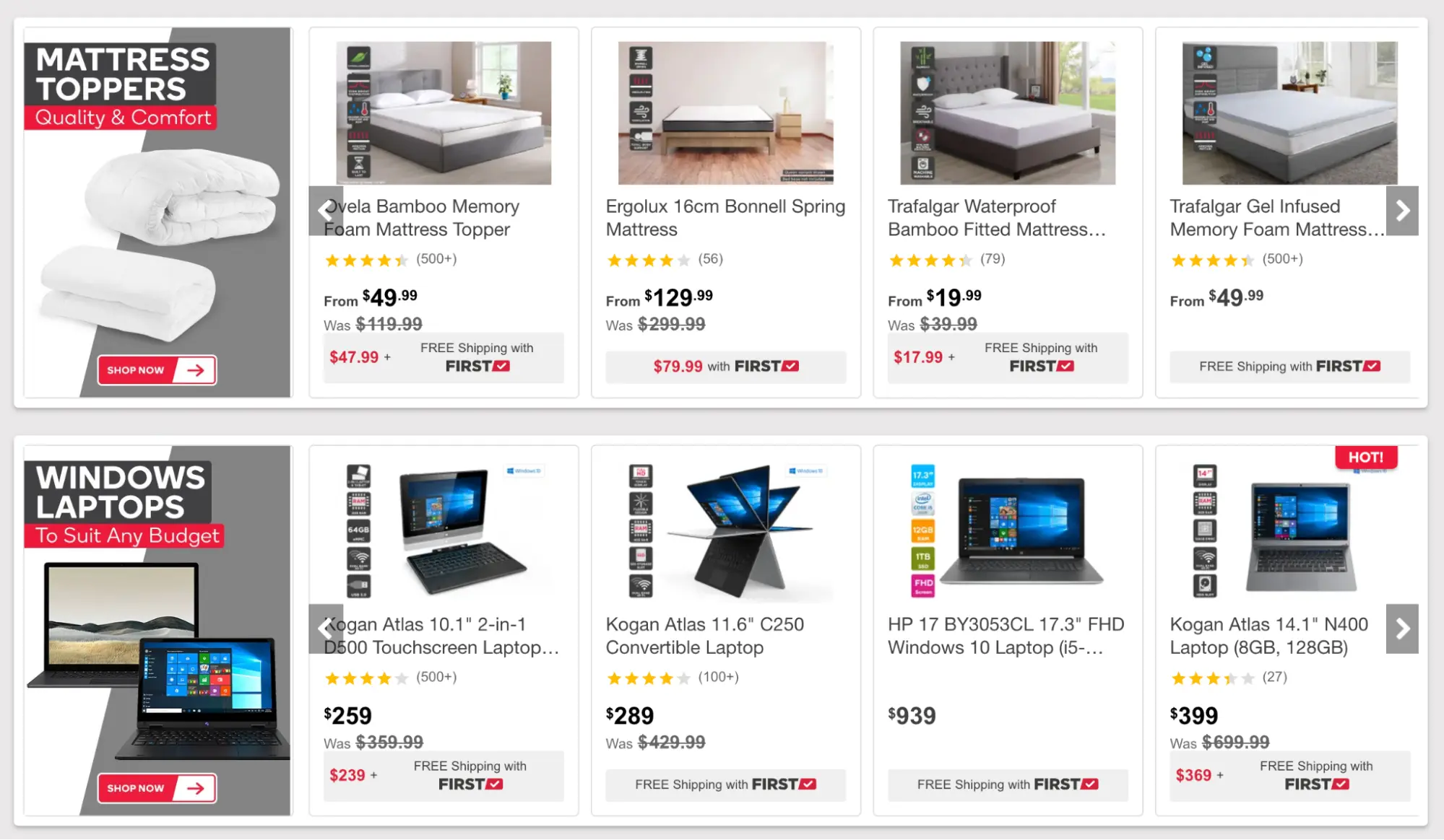 The homepage is a good place to showcase products that are tempting to the user
The homepage is a great opportunity to promote certain products in your catalogue. You can also show products that are on sale, as well as best sellers.
It’s common to display these products in a scrolling carousel, which the user can scroll through easy. Product thumbnails should include the most vital information, such as the product image, name, price, and “add to cart” button (if appropriate for the product type).
All website types
These elements work well for all of the commercial website types covered in this article, whether service-based, informational, or e-commerce.
Banners are an excellent homepage design idea
 A banner with an overlaying CTA—a common design layout that produces leads
Imagery adds colour and personality to a website. Many businesses include a large banner image on their homepage, which spans the width of the entire page, and tends to serve one or more of these purposes:
- It helps to illustrate what your business is all about
- It showcases a particular service or product
- It serves as your primary call-to-action, with the enquiry form overlaid
The banner image often contains the headline of the page too. Again, it’s critical for this text to be readable, so make sure that it doesn’t clash with the banner image itself.
Benefits
 Benefits tell the user what’s in it for them
A commercial website is a selling tool, and as such, needs to answer the most pressing question on the customer’s lips: what do I get out of this?
Most of us fly through our day like bats out of hell, trying to achieve our goals as quickly and efficiently as possible. When we search for a product or service, we want to know if it’ll meet our needs, and we want to know fast. And the best way to get this information is by scanning through a comprehensive of benefits, neatly chunked into sections or bullets.
By listing the most common and valuable benefits to the user, you’re much more likely to make a sale. This is the ethos of user-centred design—meeting the user’s needs for the design, rather than your own.
Short and sharp wording
Few people read web pages (commercial web pages, especially). Instead, they scan the page and pick out the information they’re looking for. As a result, you’ll need to make sure that your copy is short, sharp, and gets right to the point. Hiring a professional copywriter can help to improve your website’s content dramatically, and lead to more sales.
Unique Selling Points
 A row of USPs, which helps to sell your products or services to the prospect
Unique Selling Points (USPs) are pithy statements that describe how you’re different to your competitors, and help you to sell your products and services. For example, if you offer same-day delivery on your products, this would make a perfect USP for your homepage.
Include SEO keywords
Keyword research should be completed for your entire website, to identify the keywords that your customers use to find your products or services. Once identified, they should be peppered throughout each page, including your homepage.
For example, if you’re a cafe based in Brisbane’s West End, you’ll want to include the keyword phrase “West End cafe” in your copy, as this will help locals to find your business and get themselves appropriately caffeinated.
Keyword research can be a hefty process by itself. Check out our article on how to find the right types of keyword search queries for your business.
Use well-tested design patterns for your homepage design
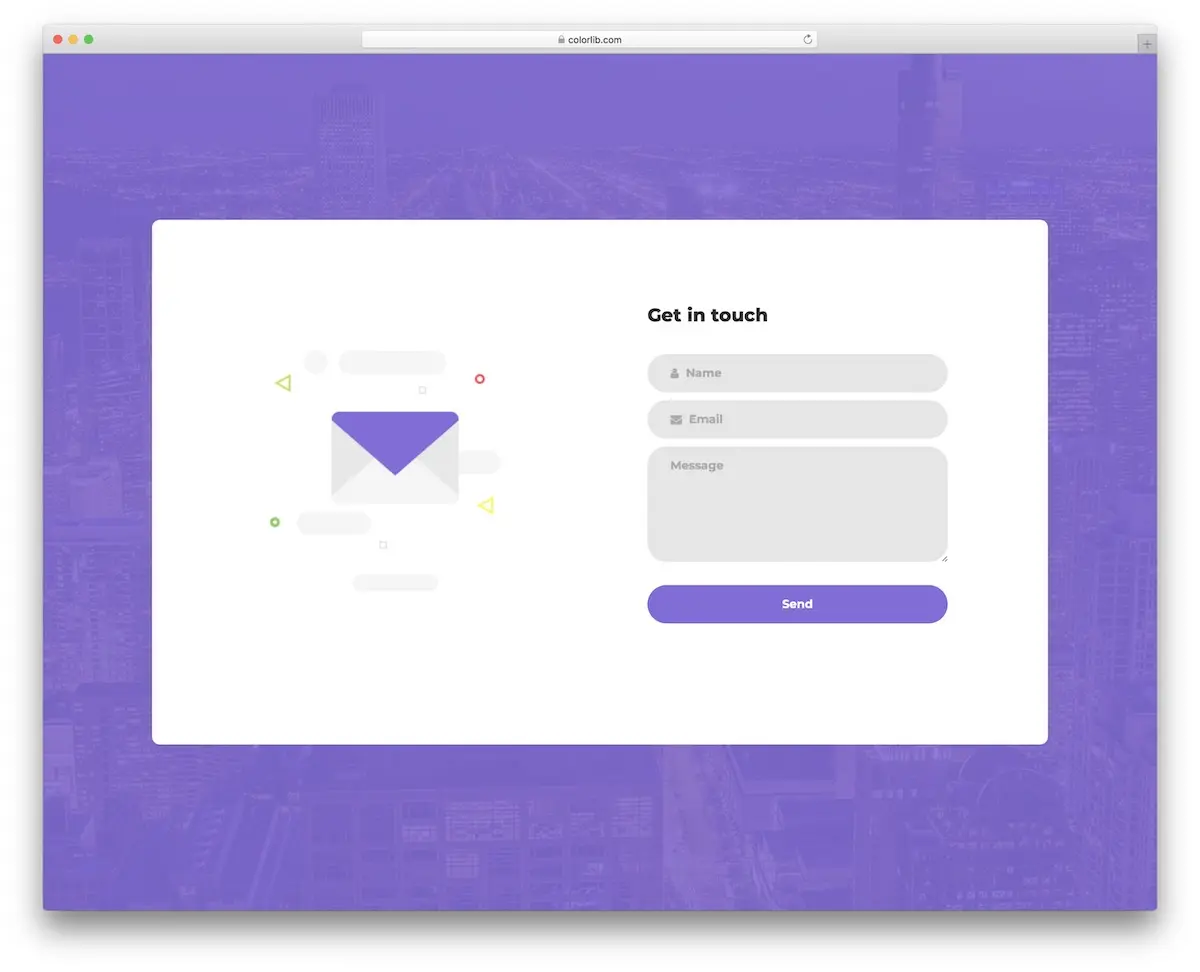 A conventional web form. This is a time-tested design pattern that people intuitively understand. Image from Colorlib.
A design pattern is how something is typically designed. A common design pattern for a website button is a colourful square with rounded edges, which screams “click me!”
Buttons and other web design patterns have remained the same for decades, because they work. While it can be tempting to try something novel with your website’s components, be careful not to stray too far from the original design pattern, as people are familiar with these patterns and may become confused when presented with something different. And as soon as someone becomes confused, they’ll probably leave your site.
Awards
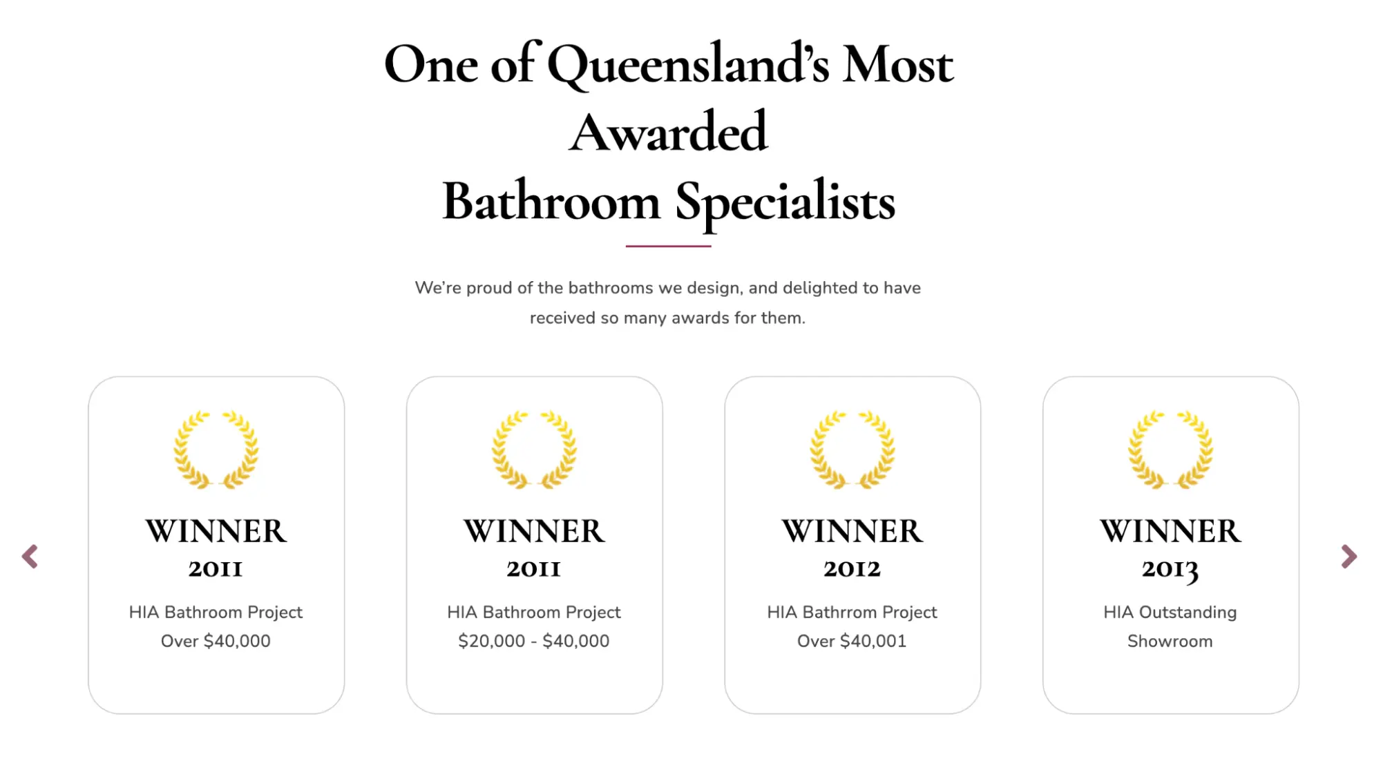 Awards impress prospects, and show off your skills
If your company has won awards, display them proudly on your homepage, as they can help tremendously with leads and sales.
Reviews
As with testimonials and case studies, reviews are a form of social proof that help to gently push the prospect towards a sale. In today’s highly competitive world, reviews can be the difference between choosing one company over another, so if you have great reviews, be sure to include these on your homepage.
To make things easy, your web developer can use a plugin that automatically grabs your reviews from Google or other platforms. And to get more reviews from your customers, check out our article on how to get more 5-star reviews.
Blogs help to keep your homepage design nice and fresh
If your business produces blogs (you should be, if you have the capacity), displaying your latest blogs on your homepage is a great way to keep the content fresh. And if your blogs are valuable to the user, they’ll quickly realise that your company knows its stuff, and will be more inclined to buy from you.
Cool homepage designs—7 awesome examples for 2022
Here’s our pick of cool homepage designs for 2022, to give you a little inspiration.
Apple
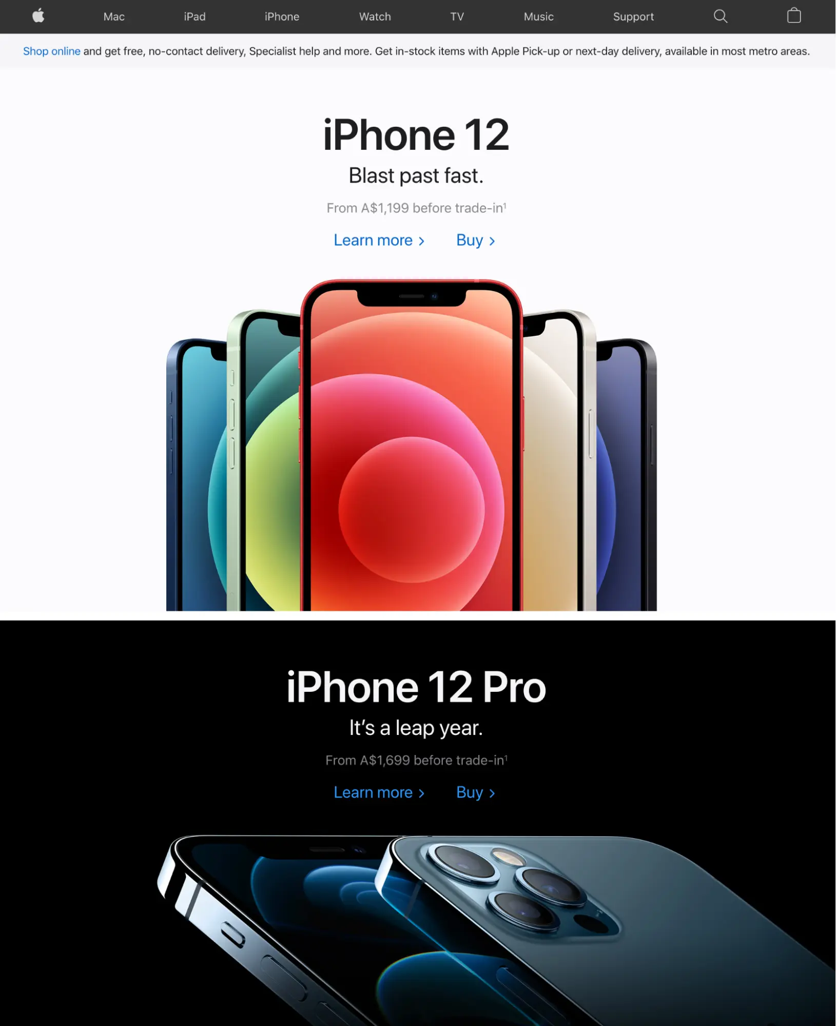
Apple is known for a handful of popular product ranges: phones, computers, watches, and iPods. So they dedicate their homepage to showing off their latest in-faux items, using high-quality, colourful imagery, and minimal content.
Most companies would need to include a persuasive selling point in the product’s headline, but Apple’s items are so popular, they don’t need to.
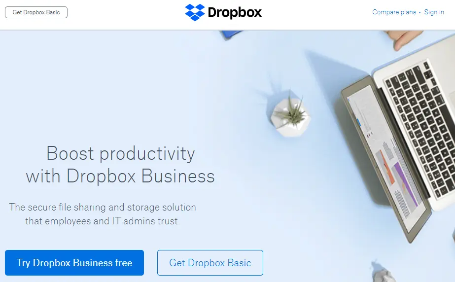
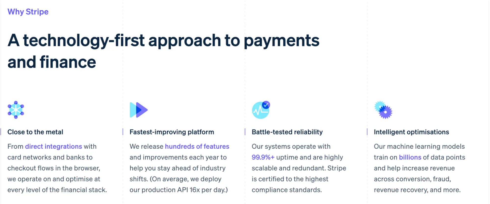
Stripe
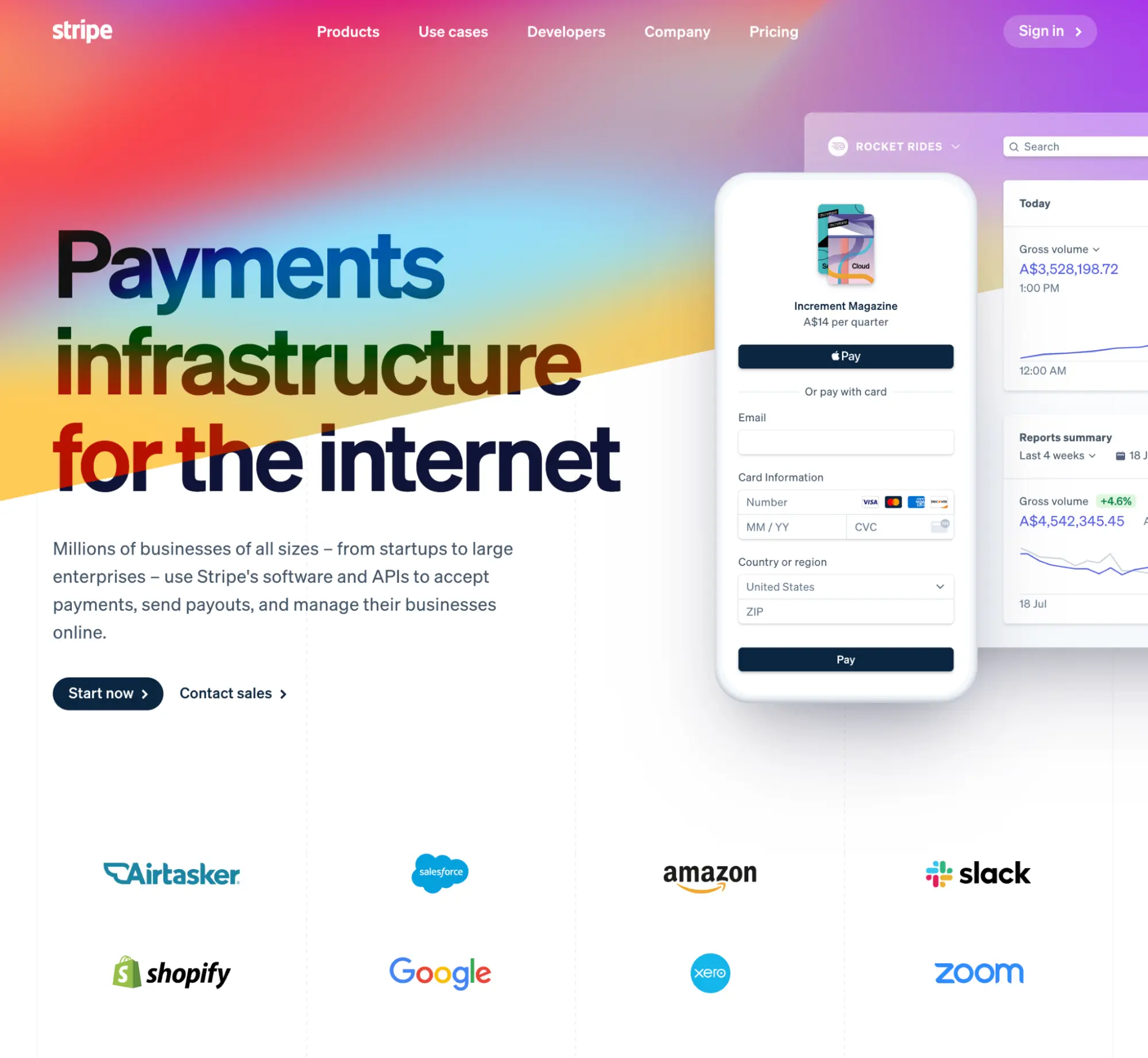
Stripe provides online payment software for businesses, so that they can easily take payments from customers.
The top half of their homepage visually demonstrates their clean software, talks about how millions of businesses use them, and then shows the impressive calibre of these businesses—Google, Amazon, Salesforce, and others.
The rest of the page is dedicated to explaining the software in more detail, its technical requirements, and benefits. The page is not only beautifully-designed, but the content is absolutely spot on. It’s an excellent example of great information design.
David Jones
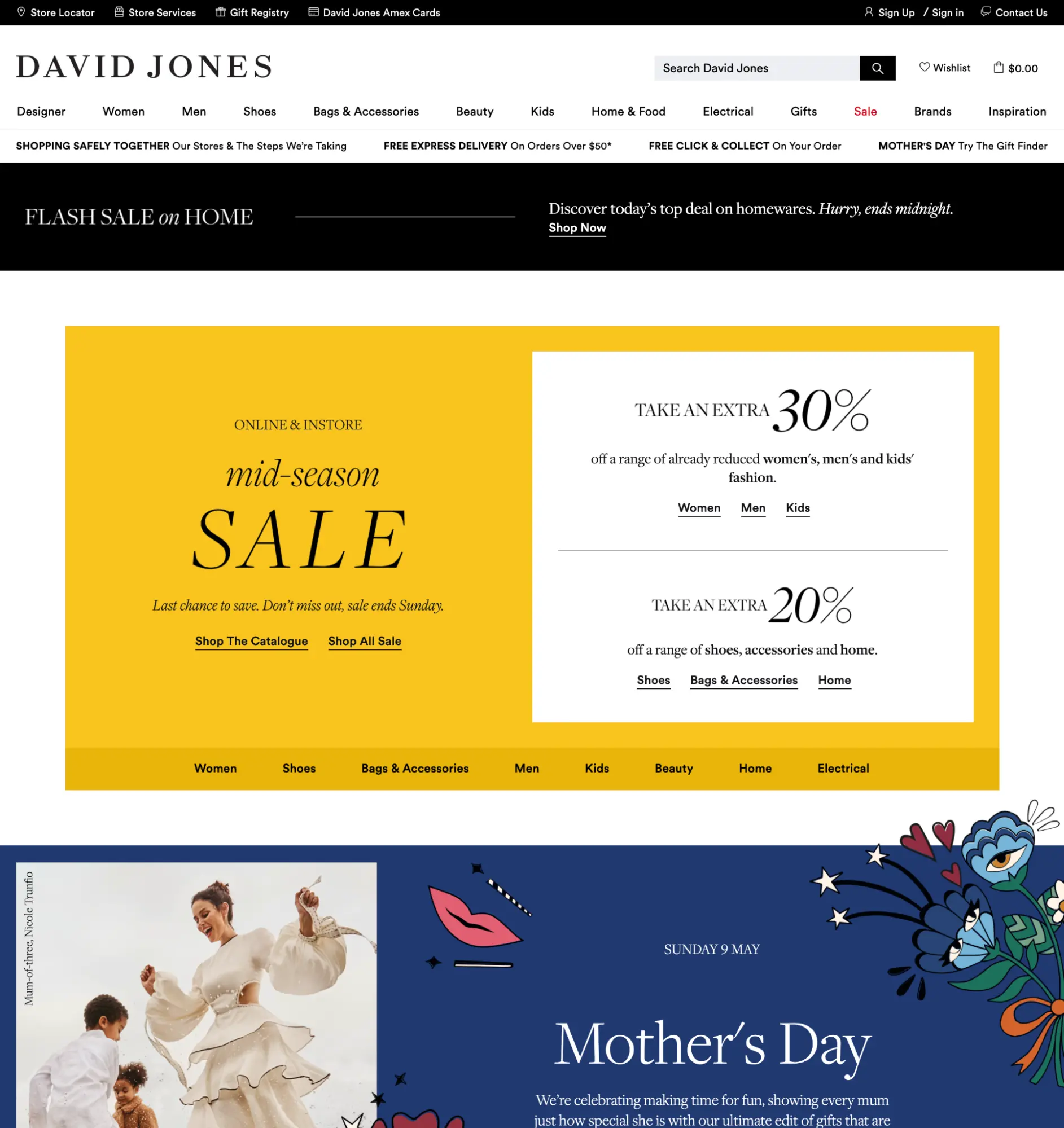
David Jones’ homepage contains a lot of content, and does a great job of distilling it down to its most important. There’s a nice example of their prime USPs, displayed in a row underneath the category navigation, as well as heavy promotion of their sale items (a good source of income for department stores), new arrivals, categories, brands, and plenty of articles to read further down the page.
Michi Ramen
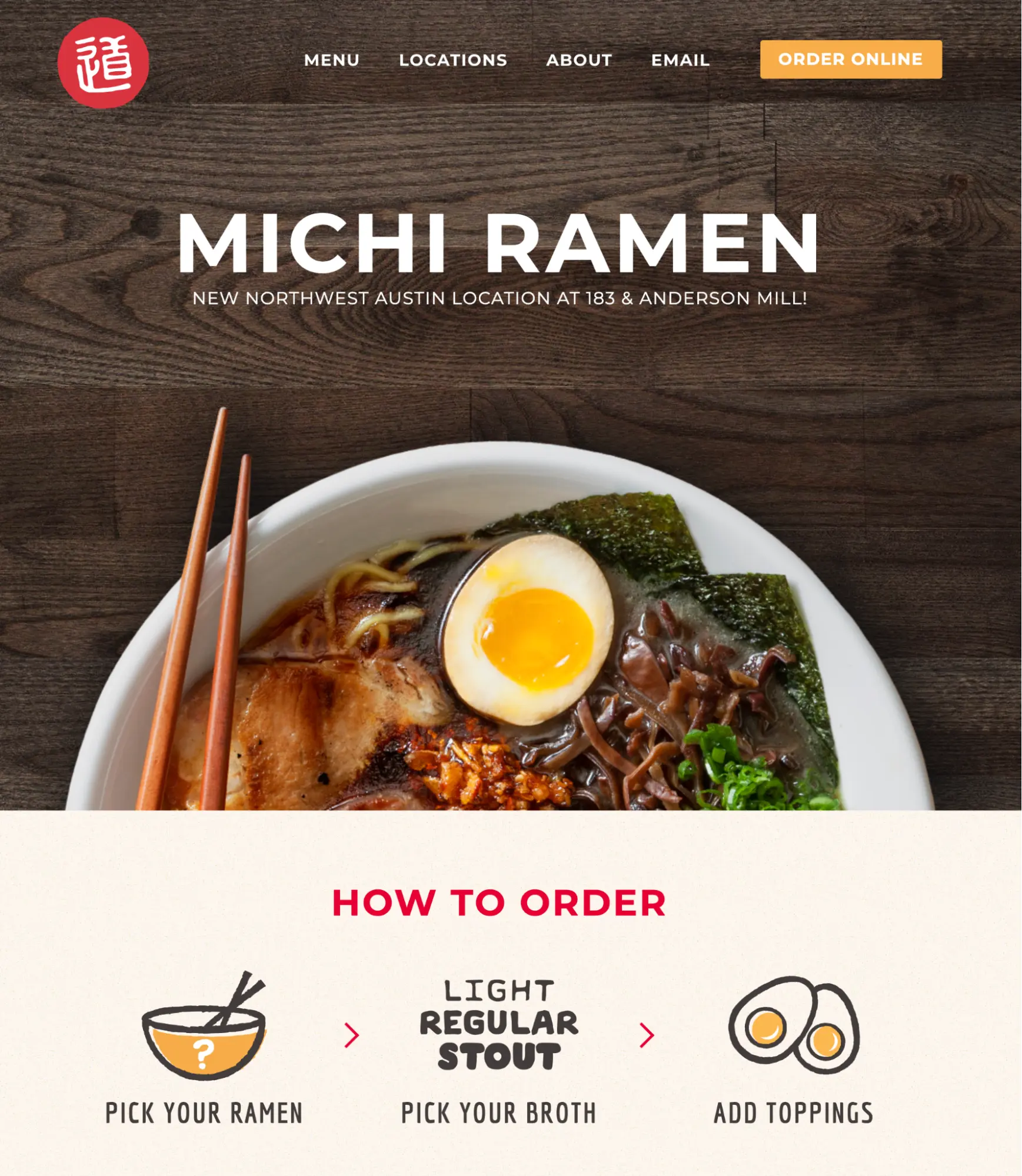
Michi Ramen is a noodle bar based in Austin, Texas, and is a great example of a simple informational site. They showcase a delicious-looking bowl of ramen in their banner, as well as their location, how you go about ordering, and a list of their various types of ramen.
If you offer a simple product or service, this is an example to follow.
Dash Bar
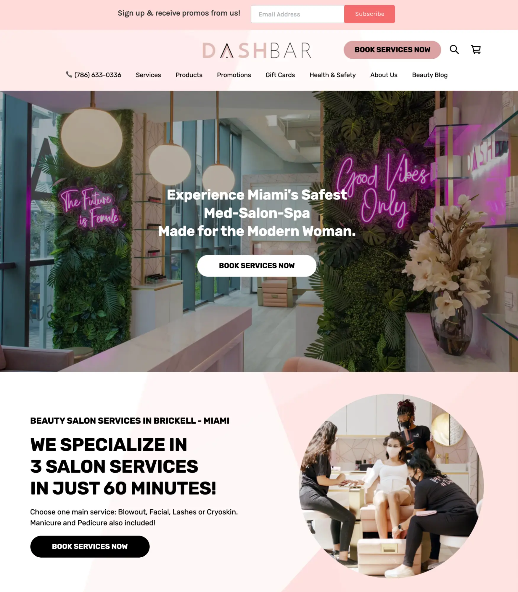
Dashbar is a hair salon in Miami, Florida. Their website has a few key purposes: to showcase their services and products, encourage people to book their services online, and share their contact information and location.
Their homepage has several clear CTAs above the fold, which invites people to book their services, and is followed by a list of clickable, illustrative images for each service, so that people can get more information if they want to.
It also promotes some of their products, has a instagram feed to build followers, and a large map that clearly shows their location in Miami. The homepage is a great example of how a local business should design their own.
Shopify
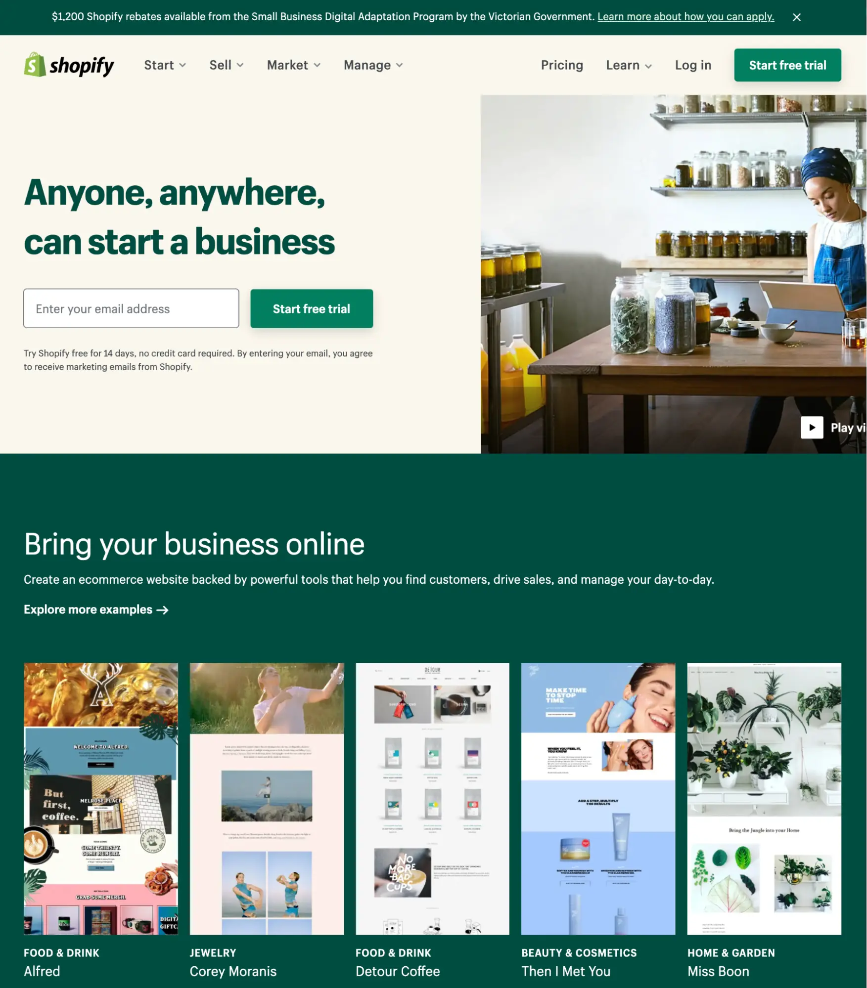
Shopify provides e-commerce software for businesses who want to sell products online. First and foremost, they’re trying to push people towards creating a free trial, which allows the customer to test the software and be contacted by a salesperson. They do this with a clear CTA within the banner, and a headline aimed at people who are just starting a new business (likely their target market).
They also do a good job at showcasing the kinds of websites that businesses can create on their platform, from a variety of industries. This provides assurance that there’s a suitable site design for the prospect’s own business.
There’s also tons of benefits when using the software, some impressive stats about their popularity, testimonials, and more.
Mahabis
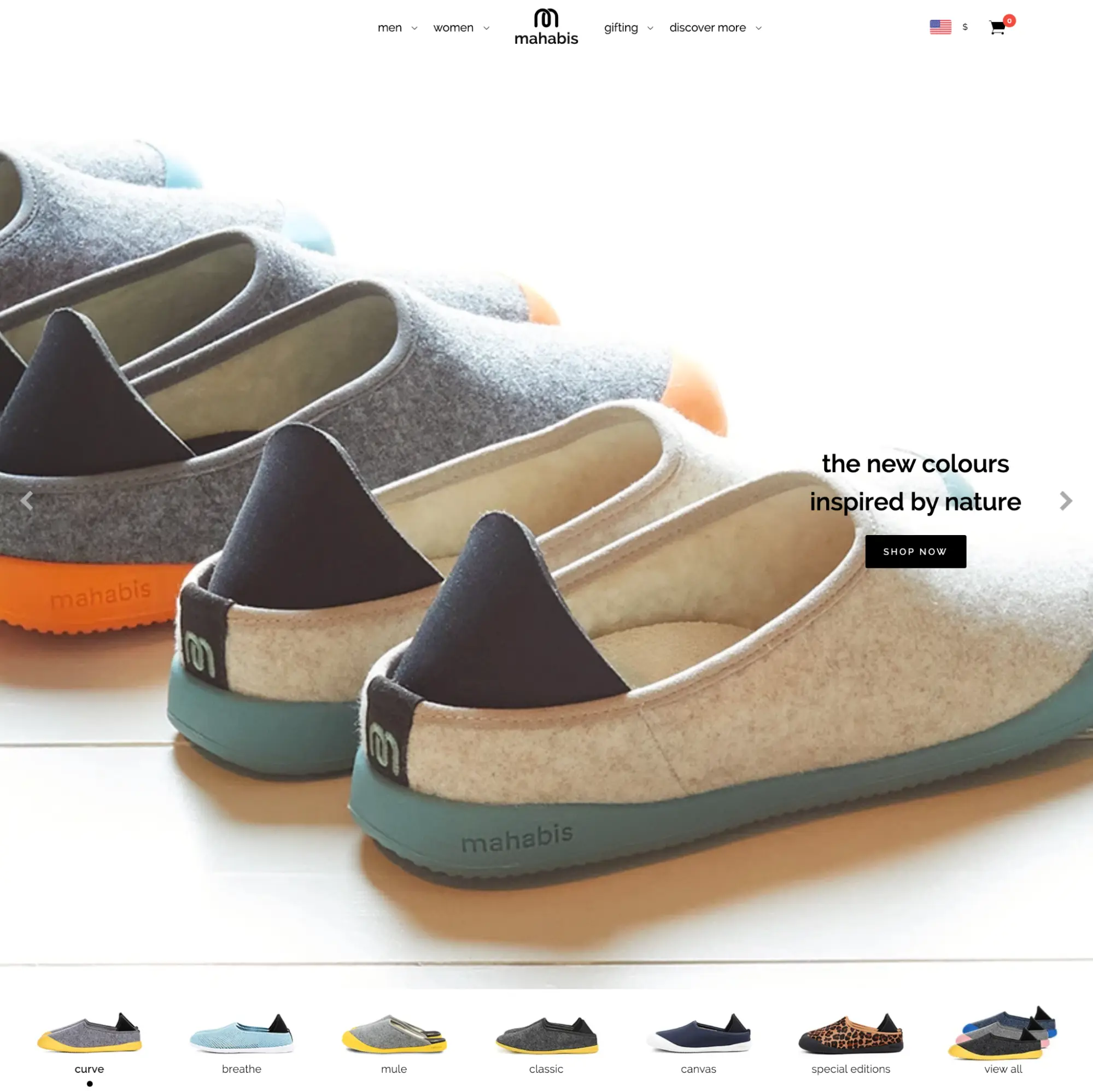
Mahabis sell a cross between a slipper and a shoe, aiming to provide people with the indoor comfort of slippers, while out and about. Because they just offer a single type of product, they dedicate their homepage to showcasing it with a large scrolling banner, and their various shoe designs listed underneath. They then launch into the customer benefits of the shoe, their values, some impressive newspapers and magazines where they’ve been featured, and more.
Their homepage is clean and simple, and works extremely well.
That’s it! We hope our selection of high-performing homepage designs give you plenty of ideas for your new website. And if you want to, you can complement this knowledge by checking our our web design terminology article, to provide a little extra background info.
Want to find out what makes a killer contact page and form? Check out our article on How To Create A World-Class Contact Us Page. When combined with this homepage design article, you’ll have the beginnings of an amazing, high-converting website.
References
1. A snapshot of blindness and low vision services in Australia, Vision 2020