7 Bad Facebook Ads Examples To Avoid For Your Adverts
Facebook accounts for about 18% of mobile advertising across the globe.1 That’s an astonishing figure that shows the power of Facebook’s reach, and why advertising on their platform is a no-brainer. But if your advert is poorly designed, your business can quickly start haemorrhaging money, which is why we’ve compiled this selection of bad Facebook ads examples, so you can learn how to get the best return on investment for your own adverts.
Let’s jump in!
7 bad Facebook ads examples
Here’s our prime selection of bad Facebook ads examples, and why we believe they fail to hit the target.
1. Compass
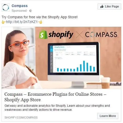 Image from Photoslurp
The first question someone might have here is: what is Compass? And why would I want to use it? The value proposition for this advert isn’t just unclear, it’s completely absent.
The ad may work if you were a Shopify user who was familiar with Compass. But for those who aren’t, it’s an unfortunate failure.
2. Oribi
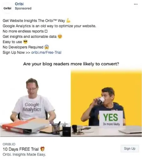 Image from SK Creative
This advert suffers from putting forward too many value propositions, shown as a six-point list. Busy company owners probably won’t bother making their way through this list—they want to see one or two clear benefits, communicated at the very start of the advert’s text.
Getting website insights The Oribi Way means nothing to them, and may continue meaning nothing to them because they’re unlikely to click on the advert. It doesn’t meet the standards of persuasive advertising, which is to say effective advertising.
3. GetResponse
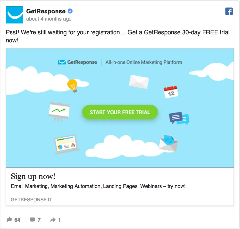 Image from Karola Karlson
GetResponse’s initial “psst!” idea is cool, because it makes the advert intriguing for the reader. But the rest of the advert fails to tell me why I’d want to register for their trial. I can see that it’s a marketing platform, but how will it help me or my business to market better to our customers? Unfortunately, none of this is explained, so I’d probably move onto something else.

4. Jon Loomer Digital
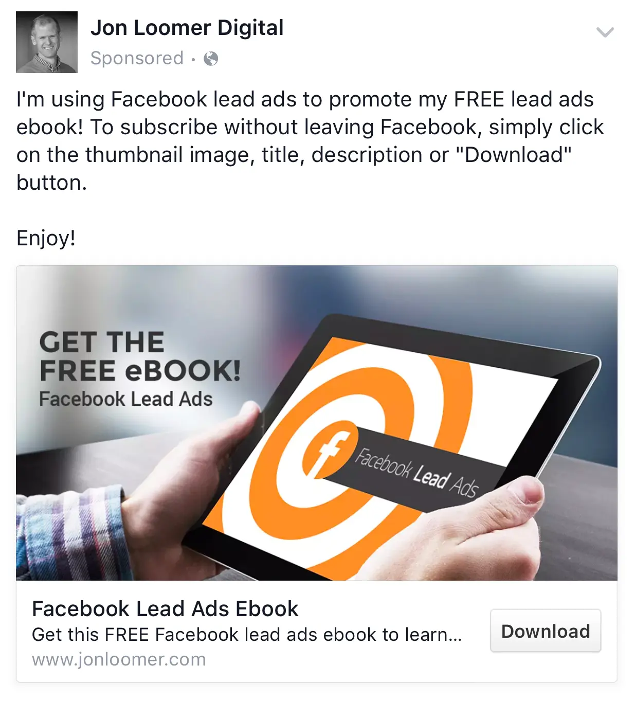
The first line of this advert is clever because it implies Jon’s expertise in creating Facebook leads ads. But it doesn’t build on this idea—am I supposed to trust that Jon knows how to create Facebook lead ads just because he’s created one himself? What am I going to learn by downloading his eBook, exactly?
On the plus side, his call-to-action is clear and direct, and the image relevant.
5. Trademark Productions

The messaging in this offer is a bit confusing and badly prioritised. When reading the first line, you might wonder what they mean by “online presence” and why you would need that for a senior living community.
Moving onto the second line makes things clear—they are offering a way to see what your elderly family member is doing while living in their care home. But even then, this isn’t clearly explained. Using this as the first line would have been clearer, and it could have been much more direct as something like the following:
6. Rainy Dayz
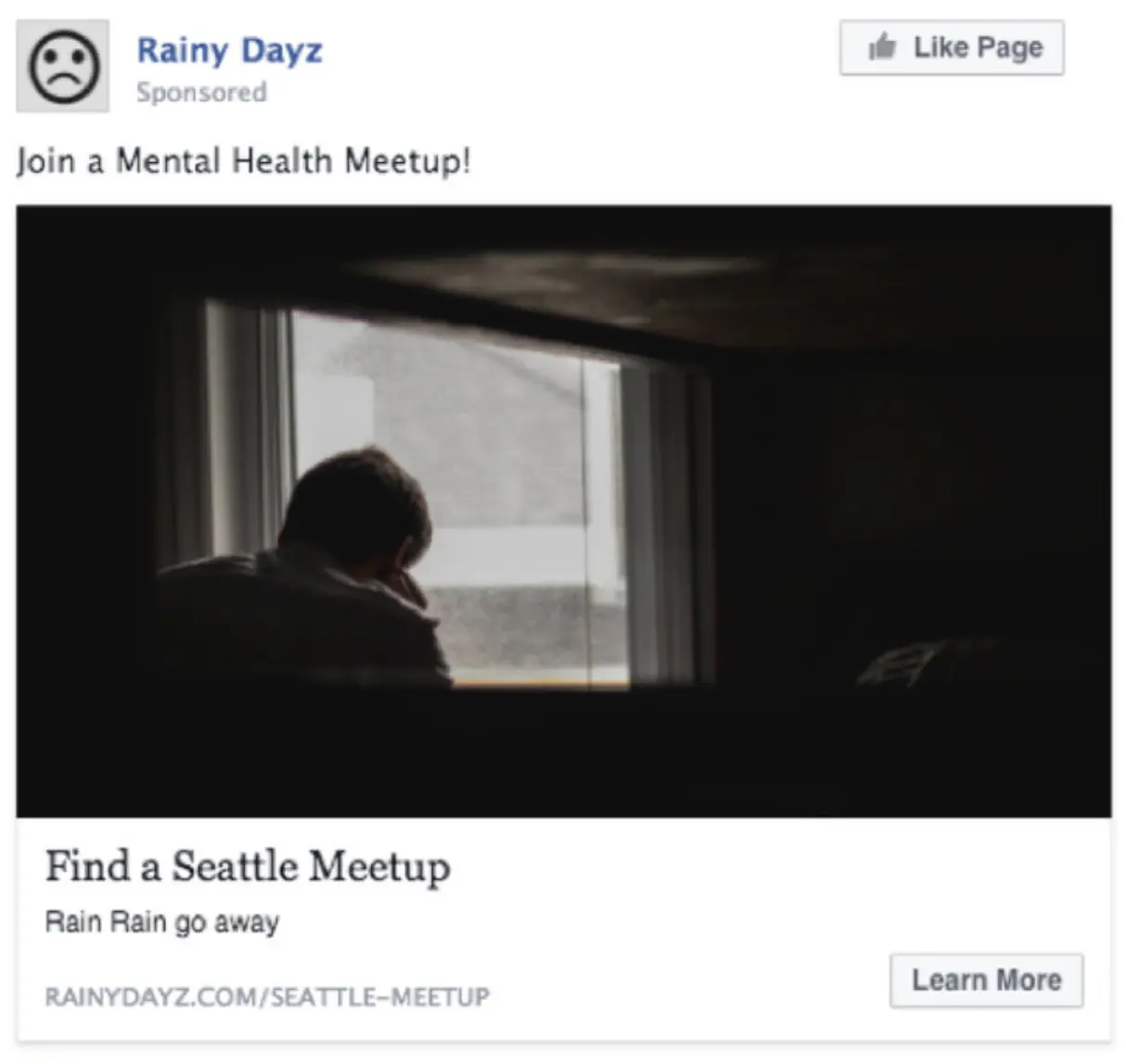 Image from Leadpages
This ad gets top marks for its precision, but doesn’t provide a clear benefit as to why you’d want to join a mental health meetup. The obvious benefit is that you can improve your mental health, but why not spell that out to the reader just to be sure?
The CTA’s wording is also vague and indirect. “Find a meetup” or “Join a meetup” are more accurate descriptions of the actions you want the reader to take.
7. Hop Market
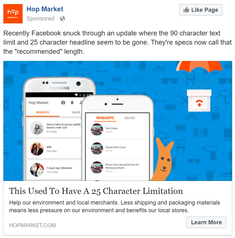 Image from Relay PM
This poorly-designed advert has an array of problems:
- It uses weak phrases like “seem to be,” which makes you doubt their confidence.
- It incorrectly uses “they’re” instead of “their”—a grammatical error that muddles the meaning.
- The subtext underneath the headline is unrelated to the ad, talking about the company’s product rather than the Facebook update. This mishmash of information makes it extremely confusing.
- The image is also unrelated to the Facebook update.
Facebook ads best practices
Now that you’ve got an idea of what doesn’t work, let’s talk about what does. Here’s a selection of Facebook ads best practices to guide you towards high-converting adverts.
Have a clear value proposition
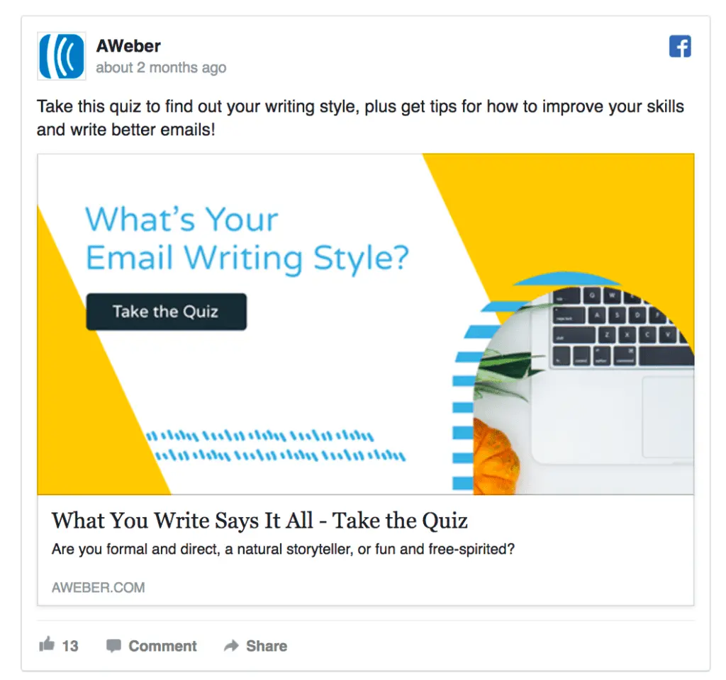 This ad from AWeber has a clear value proposition, with text that gets straight to the point. Image from Karola Karlson
Every advert needs a value proposition: a promise to deliver value to the person viewing the advert. If you’re a wine lover, an advert might offer the chance to win a trip to the Hunter Valley in exchange for your email address. If you’re a business owner, an advert might promote a trial for software that makes accounting easier.
Whatever advert you’re trying to create, make the value proposition clear as day. The reader must be able to quickly (almost immediately) perceive the value they get from your offer. If it takes them a couple of seconds to figure out what you’re offering, they’ll keep on scrolling. As you can see from our examples above, this is the most common mistake people make when creating Facebook ads.
Have a related call-to-action
 This “Sign up” call-to-action describes exactly what the user will do. Image from Insil
In a Facebook ad, the call-to-action is the button on the bottom-right corner. The text you choose for this button should be logical and relate to the thing you’re offering in the advert. It should also use the active (present tense) voice.
For example, if you’re offering a discount on a range of men’s suits, the button should read something like “Get Discount” or “Claim Discount.” If you’re promoting your company’s newsletter subscription, you may want to use something like “Subscribe Now.”
The advert’s button is the thing that the person is deciding to click on, so it must be worded properly to give them one last persuasive nudge.
Use minimal text
 This text couldn’t be any clearer, with two short instructions that describe the offer. Image from 60 Second Marketer
The internet is built on speed, both its technology and the people who use it. Not many of us dawdle when we’re online, we zip about like skittish rabbits, absorbing immense amounts of information in short periods. So if we come upon an advert with a wall of text in it, there isn’t much chance of us reading—it’s too much hard work. We use social media to relax (LOL), not to read insurmountable blocks of text from companies we don’t know.
When creating Facebook ads, keep your text nice and short. Jump straight into the benefit of the offer, and try to cover it in 150 characters or less. This will massively increase the chance of people reading the advert and taking action.
Use a relevant image
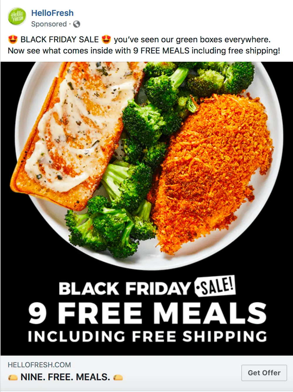 An advert for free meals that shows a delicious meal? I’m in. Image from Web FX
When two things that fall into the same group don’t match, our expectations aren’t met, and we can get a slight jarring sensation. The world hasn’t acted in how we expect it to, and so a common reaction is to get it away from us, returning to things that are safer and more controllable.
That’s why it’s important to use an image that is relevant to your advert. If your advert’s text promotes fishing charters from Airlie Beach, and is accompanied by an image of a sunset without a fishing boat in sight, the viewer may feel a bit confused. They probably won’t consciously register why they’re confused, because the interaction happens so quickly. But they’ll likely scroll past your advert.
Be sure to use an image that is directly related to your offer.
Keen to understand how to measure your Facebook ads more effectively? Check out our article on the most important social media advertising metrics. We also delve into some Facebook marketing tactics you need to unlearn if you’re interested and can also help with any social media ad campaigns you might need assistance with.
Bad facebook ads examples—summary
That’s it—seven bad Facebook ads examples not to copy, and some guiding principles for creating great ads. We hope this article helps you to design and promote awesome adverts that boost your revenue. Thanks for reading!
References
- Khalid Saleh, Facebook Advertising Statistics and Trends [Infographic], Invesp